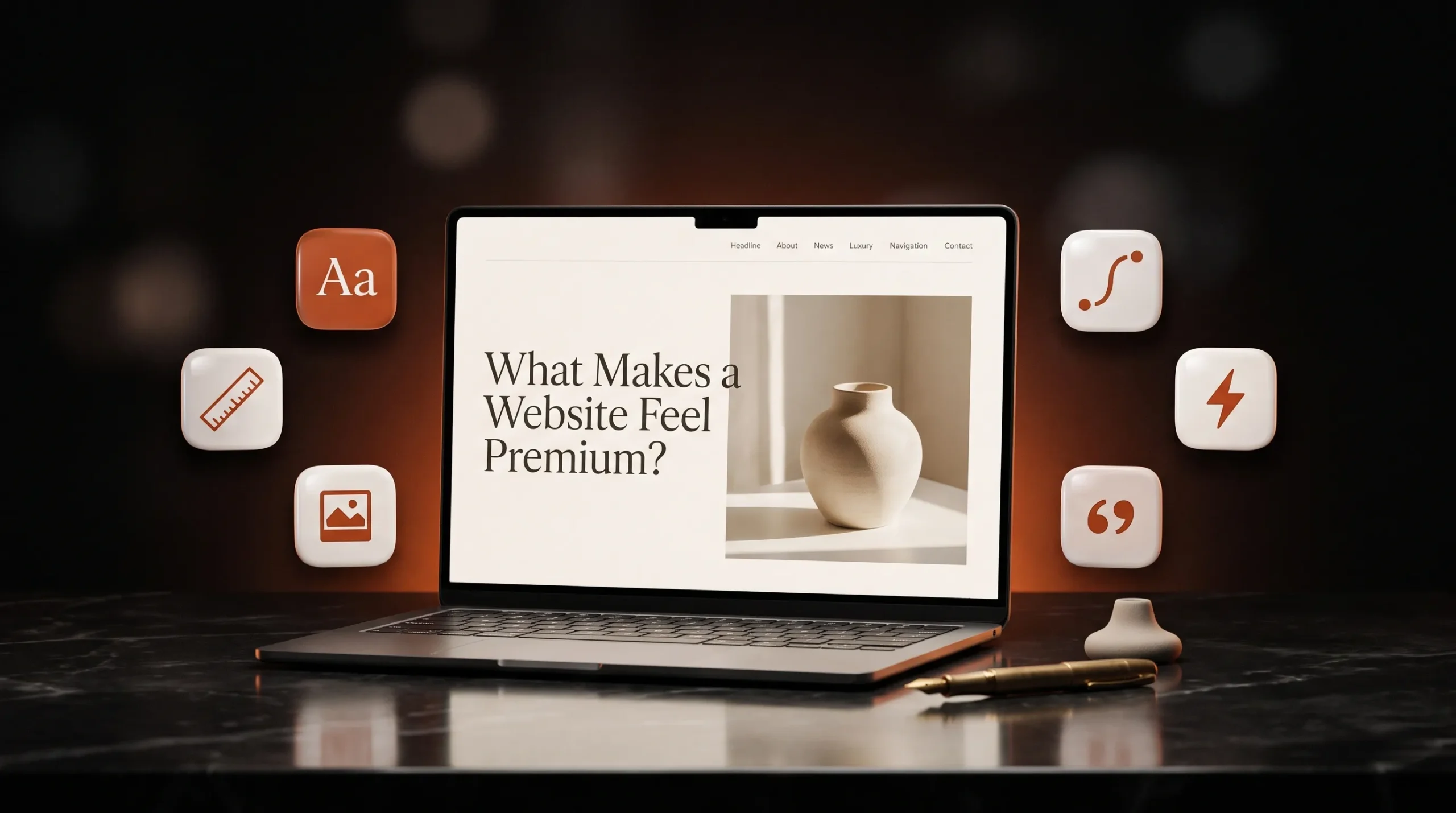
What Makes a Website Feel Premium?

Visitors decide in the first few seconds whether a site feels premium. That decision rests on six details: type, spacing, imagery, motion, speed and words.

Article

01
Type That Feels Chosen
Typography carries most of a site's personality. Premium sites use one or two typefaces, a clear size scale and generous line height. Headings feel deliberate and body text is easy to read. Default fonts, five different sizes on one screen and long lines of small grey text do the opposite. Pick a type pairing that fits your brand, set a scale of five or six sizes and use it on every page.
02
Space Around Everything
Whitespace reads as confidence. When every section is packed edge to edge, the page looks cheap even if each element is well made. Give headings room above them, keep paragraphs short and let images breathe. A spacing system built on fixed steps, such as 8, 16, 24 and 48 pixels, keeps the rhythm even from one page to the next.
03
Real Images, Used Sparingly
Stock photos of handshakes and laptops make a site look like everyone else's. Premium sites use their own photography, product shots or custom illustration, and fewer of them. One strong image per section does more than a grid of six generic ones. If you don't have photography yet, a clean layout with no image is better than a borrowed one.
04
Motion With a Purpose
Small, quick animations make a site feel crafted. Think of a button that responds to hover, or a section that eases in as you scroll. They should guide attention and then get out of the way. Animations that are slow, constant or block reading make the site feel heavy, and on older phones they make it stutter. We test every animation on low-end devices before launch for that reason.
05
Speed You Can Feel
A premium site responds the moment you tap. Pages that take several seconds to show anything, or jump around as images load, undo all the design work above. Size and compress images properly, load fonts efficiently and keep scripts to what each page needs. Run your site through Google PageSpeed Insights on mobile and fix what it flags first.
06
Words That Sound Like You
Premium brands speak plainly and specifically. Phrases like "innovative solutions" and "world-class service" could belong to any company, so visitors skip them. Say what you do, for whom and what happens next, in the words your clients use. When the message is clear, the design can be quieter.
07
Does a Premium Website Have to Be Expensive?
Most of the details above are design decisions: a disciplined type scale, consistent spacing, fewer and better images and short copy. They take care more than budget. Custom photography and motion add cost, but a well-made site without them can still feel premium.
08
Can a Template Feel Premium?
It can, if you strip it back. Replace the stock imagery, cut sections you don't need, set your own type scale and remove effects that slow the page. The more you change, the closer you get to paying for a custom site.

Your Website Should Move With Your Brand.

A redesign isn’t always about making things look newer. It’s about making your website clearer, more useful and more aligned with where your brand is today.

More Ideas. Better Websites.

More thoughts on web design, user experience and building digital experiences that stand out.

What Makes a Website Feel Premium?

Visitors decide in the first few seconds whether a site feels premium. That decision rests on six details: type, spacing, imagery, motion, speed and words.

Custom Website vs Template: What’s the Real Cost?

A template gets a site live quickly and cheaply. A custom design costs more upfront and fits your business exactly. The useful comparison is what each costs over the next two or three years.

Why Good UI/UX Starts Before the Design

Many website problems that look like design problems start earlier: unclear goals, a vague audience or content written last. Good UI/UX settles those before anyone opens Figma.