Designing Websites That Actually Convert

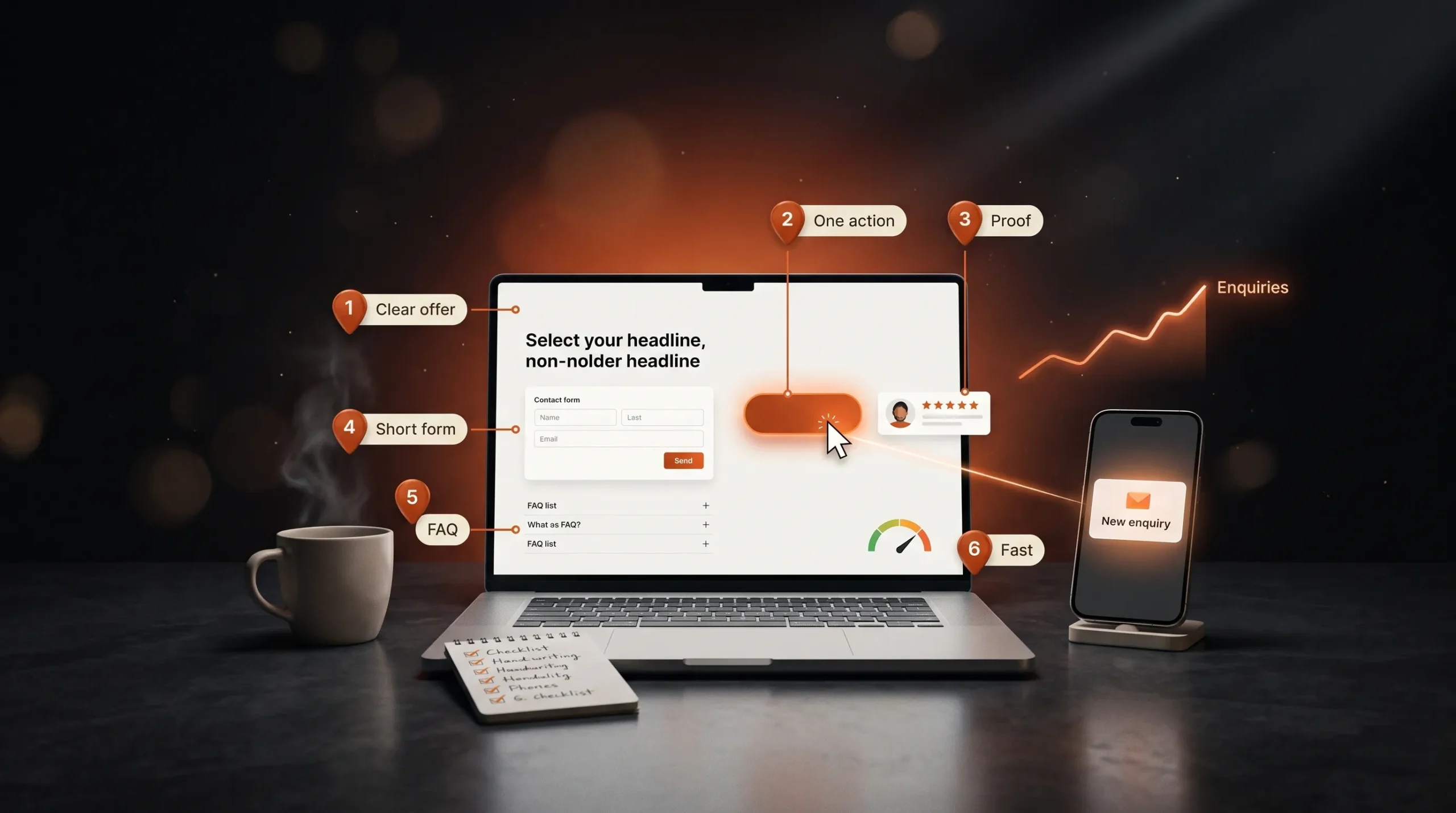
A website converts when a visitor understands the offer, trusts it and knows the next step. These six changes target each of those, and most can be made without a full redesign.

Article

01
Say What You Offer in One Line
Visitors decide quickly whether they are in the right place. Your hero heading should say what you do and for whom, in plain words. If someone who reads only the heading can't repeat your offer back to you, rewrite it before changing anything else.
02
Give Every Page One Main Action
Pick the one action you want on each page, such as booking a call or sending an enquiry, and make it the most visible button. Secondary links can stay, styled more quietly. When three buttons compete for attention, visitors often choose none of them.
03
Put Proof Next to Decisions
Testimonials, client logos, ratings and project results work best beside the moment of decision: near the call to action, the pricing or the form. Use real names and specifics. One quote that says what changed for a client does more than five that only say the team was great.
04
Shorten the Form
Every extra field is another reason to leave. Ask only for what you need to reply: name, email and a short message, plus one or two questions that help you qualify the enquiry. Say near the button how quickly you will respond, so people know what happens after they press send.
05
Answer Objections Before They Come Up
Visitors hesitate over cost, timing, whether they can edit the site themselves and who they will be working with. Answer those on the page, in a short FAQ or beside the call to action. Each answered question removes a reason to leave and compare you with someone else.
06
Make It Fast, Then Measure
Slow pages lose visitors before they see your offer, especially on phones. Keep pages light, then set up analytics with enquiries tracked as a goal, so you can see which changes work. If you want a second opinion on your site, tell us what you are building and we will reply with a clear scope.
07
How Many Calls to Action Should a Page Have?
One main action per page, repeated where it helps: in the hero, after your strongest proof and at the end. Secondary actions, like reading a case study, should look quieter so they don't compete with it.
08
How Long Before Design Changes Show Results?
Give each change enough traffic to judge. For many small business sites that means several weeks. Change one thing at a time and compare enquiries over periods of the same length before and after.

Your Website Should Move With Your Brand.

A redesign isn’t always about making things look newer. It’s about making your website clearer, more useful and more aligned with where your brand is today.

More Ideas. Better Websites.

More thoughts on web design, user experience and building digital experiences that stand out.

What Makes a Website Feel Premium?

Visitors decide in the first few seconds whether a site feels premium. That decision rests on six details: type, spacing, imagery, motion, speed and words.

Custom Website vs Template: What’s the Real Cost?

A template gets a site live quickly and cheaply. A custom design costs more upfront and fits your business exactly. The useful comparison is what each costs over the next two or three years.

Why Good UI/UX Starts Before the Design

Many website problems that look like design problems start earlier: unclear goals, a vague audience or content written last. Good UI/UX settles those before anyone opens Figma.