5 Signs Your Website Needs a Redesign

Your website can still load and take enquiries while holding your brand back. These five signs show when a redesign will do more than another round of fixes.

Article

01
Your Website Looks Outdated
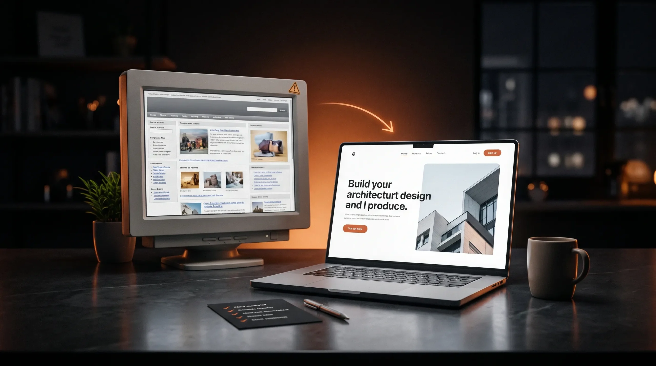
Visitors judge how credible a business is within seconds of landing, and mostly on how the site looks. Dated type, crowded layouts, stock photos and small, low-contrast text all suggest the business may be just as out of date. Open your homepage next to the three competitors your clients compare you with. If yours looks the oldest, the design is costing you trust before anyone reads a word. A redesign here is mostly visual: new type, spacing and imagery on a structure that already works.
02
Visitors Can't Find What They Need
Open your site on a phone and try to reach a service page, your pricing and the contact form. Count the taps. If it takes more than two or three, or you have to guess where things are, your visitors are guessing too. Many give up. Navigation problems usually come from a site that grew one page at a time. The fix is a new structure. Group pages by what visitors are trying to do, keep only the menu items people use and make the next step obvious on every page.
03
It Doesn't Work Well on Mobile
For many businesses, phones now bring more visits than desktops, so check the split in your analytics first. Then test the site on a real phone. Look for text you have to zoom to read, buttons too close together, awkward forms and images that load slowly on mobile data. Google ranks pages using the mobile version of your site, so a poor phone experience costs you search traffic as well as enquiries. A layout built for desktop and squeezed down rarely improves with page-by-page patches. It needs to be designed for small screens from the start.
04
Your Brand Has Changed
Businesses change faster than their websites. New services, a new audience, a refreshed logo or a move upmarket can leave the site describing a company that no longer exists. Read your homepage the way a new client would. Does it describe what you sell today, at the price level you charge today, to the people you want to work with? If the answer is no, the redesign starts with the words: decide what the site must say, then design the pages that carry it.
05
It Isn't Bringing In Enquiries
A site can look good and still bring in very little. Compare how many people visit each month with how many contact you. If traffic is steady but enquiries are rare, the problem is usually the path from landing to getting in touch. Common causes are an unclear offer, a call to action that is hard to find and a contact form that asks too much. A redesign aimed at enquiries fixes that path first, then compares the numbers before and after launch.
06
How Often Should You Redesign a Website?
There is no fixed schedule. Many sites are redesigned every few years, but the five signs above matter more than the date. A site that still looks current, works on phones and brings in enquiries can run longer. One that fails two or more of these checks is due now.
07
What Is the Difference Between a Redesign and a Rebuild?
A redesign changes how the site looks and how its pages are organised, often on the same platform. A rebuild also replaces the platform or code underneath. If your current platform is slow, hard to edit or limits what you can add, plan a rebuild. If it works well, a redesign on top of it is faster and cheaper.
08
What to Do Next
If two or more of these signs describe your site, plan a redesign instead of another round of fixes. Start by listing who the site is for and what it must say, then design from a blank canvas. That is how every ENFORG project starts. We agree on goals and content first, you approve the design in Figma, and the same team builds it. Tell us about your site and you will get a clear scope and a fixed price before any work starts.

Your Website Should Move With Your Brand.

A redesign isn’t always about making things look newer. It’s about making your website clearer, more useful and more aligned with where your brand is today.

More Ideas. Better Websites.

More thoughts on web design, user experience and building digital experiences that stand out.

What Makes a Website Feel Premium?

Visitors decide in the first few seconds whether a site feels premium. That decision rests on six details: type, spacing, imagery, motion, speed and words.

Custom Website vs Template: What’s the Real Cost?

A template gets a site live quickly and cheaply. A custom design costs more upfront and fits your business exactly. The useful comparison is what each costs over the next two or three years.

Why Good UI/UX Starts Before the Design

Many website problems that look like design problems start earlier: unclear goals, a vague audience or content written last. Good UI/UX settles those before anyone opens Figma.